As we love design, our eyes are always focus in a icon beauty, the colors that are used, the conception of the logos. Yes, there is design everywhere and one event we can see it as a big deal is in the Olympic games. Right now Tokyo is living this huge ambiance, even if the pandemic made things unexpected. But design survives.
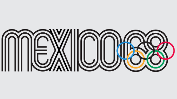
The Olympics have produced some of the most exciting brand identities of the past century. Take Lance Wyman’s Op Art-inspired branding for the 1968 Mexico City Olympics, which still figures prominently throughout the city more than 50 years after the final gold medal was hung. The Olympics have long enabled host cities to communicate their hopes and ambitions to the world, and the best Olympic logos are like a welcoming committee, enticing viewers to learn more.
If we ask you what would be the best Olympic games logo below that you like the most? What would your answer be? Or none of them?